

RISO PRINTING GUIDE
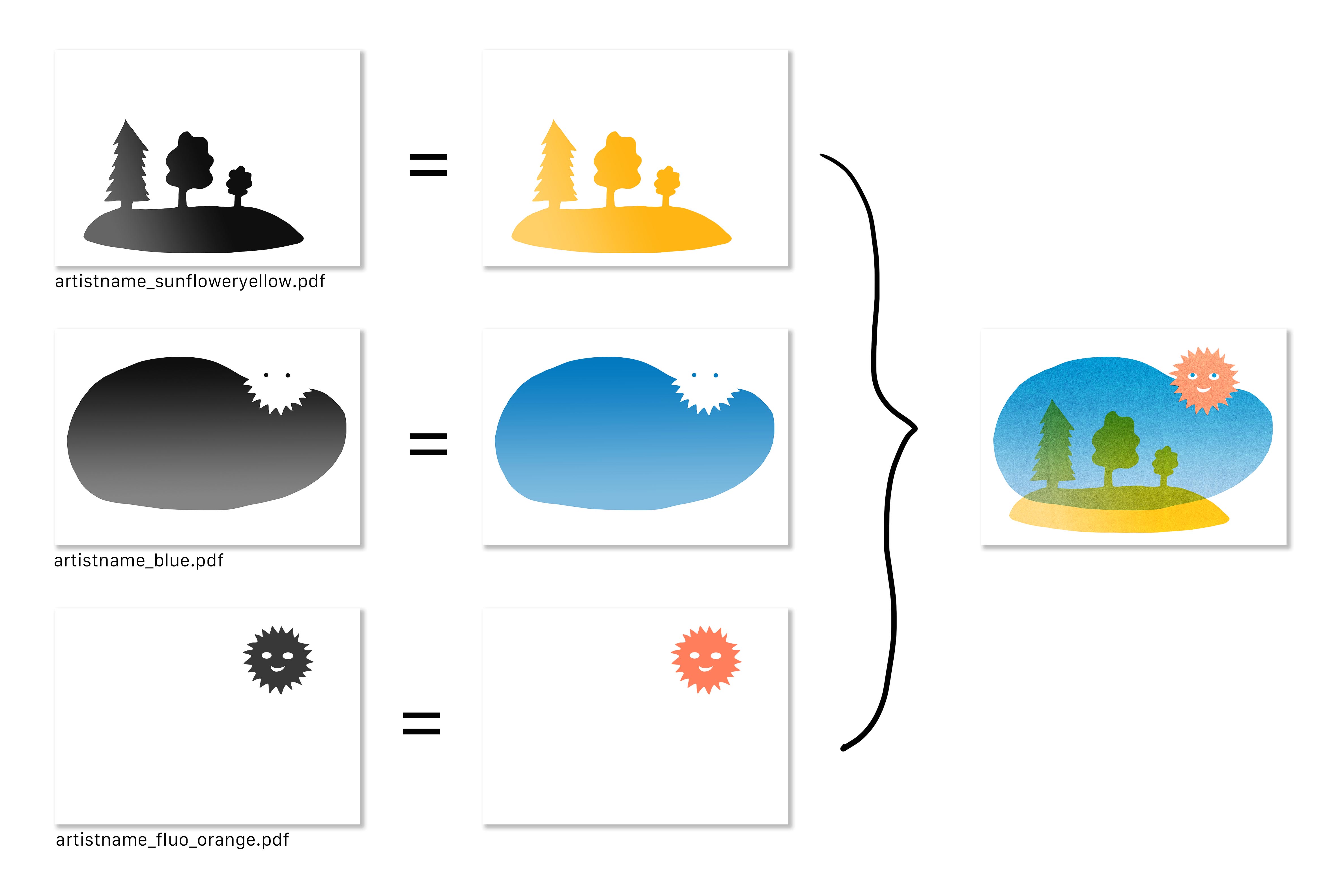
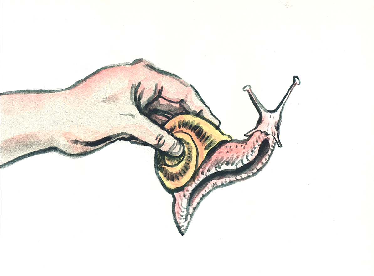
Riso prints images one colour at a time, layered on top of each other.
The colours are translucent so you can mix them by layering them at different intensities.
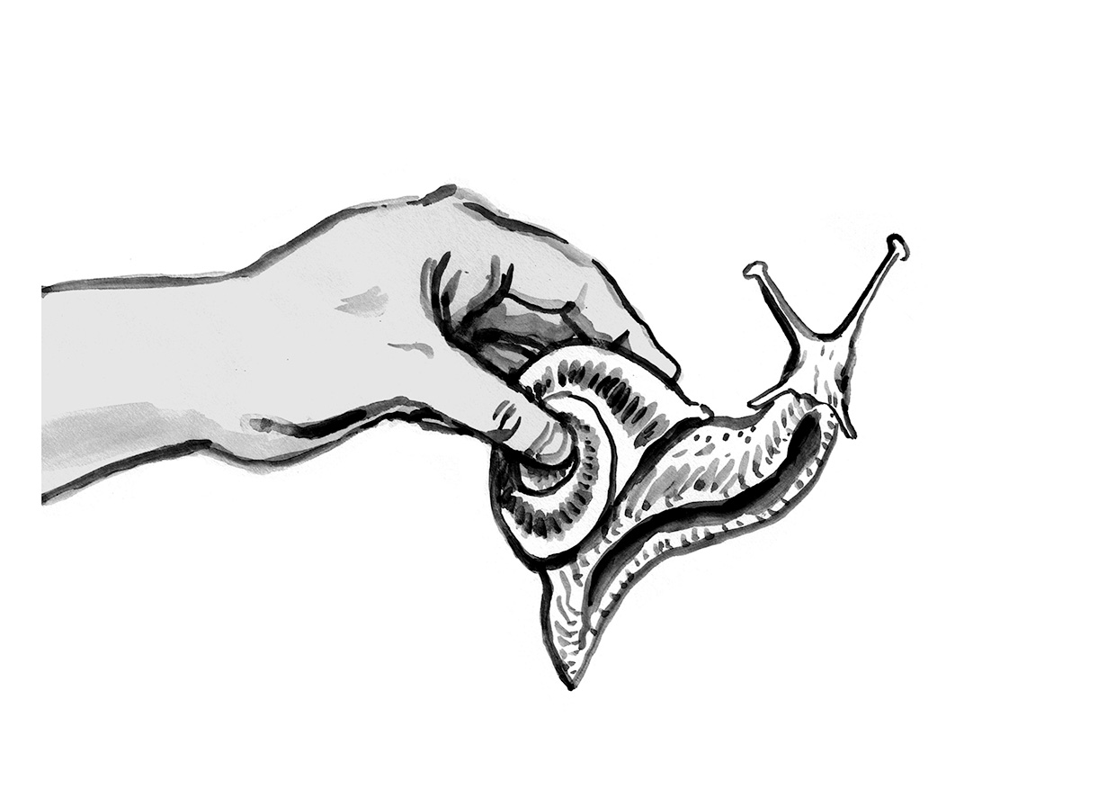
To create an image for riso, you have to create a separate greyscale image for each colour layer.
As in the example, a dark grey or black area will result in an area of intense colour in the print, and a light grey area will become an area of paler colour.
Go check our colour chart to have a better idea of how the colours react at different percentages of intensity.

There is always a slight misregistration in riso: your layers won’t align perfectly. Take this into account when you make your image: avoid overlapping layers of thin lines or text, and know that tiny details in several colours won’t perfectly align.
When you’re ready to send us your files, flatten all the layers and send each colour separation as a greyscale PDF, 300dpi, with the ink colour and project referenced in each file name.
When you send us your files, don’t forget to:
When you’re ready to send us your files, flatten all the layers and send each colour separation as a greyscale PDF, 300dpi, with the ink colour and project referenced in each file name.
When you send us your files, don’t forget to:
- Leave a 1cm margin around your image - riso can’t print to the edge of the paper
- Avoid big areas covered in flat colour at more than 80% opacity (it creates pools of ink in the image that can’t dry evenly)
- If your project has text in it, use InDesign or Illustrator (or any software using vectors rather than pixels) to set the text in the layer, otherwise pixelisation might occur. Text smaller than 8pt will be difficult to print, and knock-out text (text white within a layer of colour) especially needs to be 8 or 10pt at the smallest.
- Send us a colour mockup of your project so we can see what you’re aiming for.
Riso printing is eco friendlier than other printing processes : it doesn’t heat up the inks thus using very little energy to print and producing no fine particle emissions; the inks are made from rice bran oil leftover from rice processing, so there are no micro plastics released from printing. We print on non glossy or recycled paper and use a second hand machine and drums.
The riso look is immediately recognisable, with its vibrant, intense colours and beautiful dot textures.
Its handmade quality comes with idiosyncrasies. All the prints will be a bit different!
The riso look is immediately recognisable, with its vibrant, intense colours and beautiful dot textures.
Its handmade quality comes with idiosyncrasies. All the prints will be a bit different!